Tuesday, 31 January 2012
The Good Machinery
Decorative Merchandise by The Good Machinery
The painted animals are interesting as they are sureal painted with bright unrealistic colours. They are humours and collectable.
Thursday, 26 January 2012
How to...
I was thinking of making a "how to" book but haven't decided on the content. This poster could be transformed in to a book aswel and having poster and I will consider both when designing my "how to"
Tattly
Tattly is a website that sell temporary tattoo which they hire people to design. This is an other use for illustration, it is humours and a novelty but popular with today culture.
The tattoo are not designed to look like your average tribal or pattern tattoo, but humours ones that you wouldn't normally get.
These are some of my favourites.
The tattoo are not designed to look like your average tribal or pattern tattoo, but humours ones that you wouldn't normally get.
These are some of my favourites.
Wednesday, 25 January 2012
Vivienne Westwood
I have been researching to find out what inspires Vivienne Westwoods fashion designs
this is what I have found
What inspires Westwood?
Westwood's inspiration changes all the time, but since the 1980s she has found inspiration in the V&A's collections of fashion, furniture and paintings.
During this period Vivienne’s heros changed from punks and ragamuffins to ‘Tatler’ girls wearing clothes that parodied the upper class. A chance encounter inspired one of her most important and influential collections, the Harris Tweed collection of Autumn/Winter 1987.
“My whole idea for this collection was stolen from a little girl I saw on the tube one day. She couldn’t have been more than 14. She had a little plaited bun, a Harris Tweed jacket and a bag with a pair of ballet shoes in it. She looked so cool and composed standing there.”
Rebecca Stern
LilyPad Embroidery
The outcome is simple and familiar, the execution, on the other hand, is poetic in so many levels. The mix of these apparently dissociated crafts is ingenious and extremely compelling.
The flower head at the center is called LilyPad Arduino. It is a microcontroller board designed for wearables and e-textiles that can be sewn to fabric and similarly mounted power supplies, sensors and actuators with conductive thread. The LilyPad Arduino was designed and developed by Leah Buechley and SparkFun Electronics.
Working with the LilyPad Arduino, and in true embroidery sampler fashion, Rebecca Stern composed this circuit to see what she could do. The embroidery uses traditional floss and techniques mixed with lights and sounds generated by the onboard software. The amount of light sensed by the sensor changes the speed and pitch of the lights and sounds generated, with more light increasing the overall pace.
Stephanie Posavec
A very imaginative project where the artist has studied different writing styles and produced flowery images
Writing Without Words, by Stephanie Posavec is a series of striking visualizations exploring the differences in writing style between authors of various modern classics. The images shown here are a visualization of Part One from the book On the Road by Jack Kerouac. In this piece, entitled Literary Organism, each literary component was divided hierarchically into even smaller parts - Part, Chapters, Paragraphs, Sentences, and ultimately Words, the smallest branch in the diagram. Stephanie also created different colors to distinguish the eleven thematic categories she created for the entirety of On the Road. Some categories include: Social Events & Interaction, Travel, Work & Survival, and Character Sketches, among others.
visualcomplexity.com
Elijah Meeks
Another example of turning information in to an illustration. It think this work looks beautiful and I wouldn't have guessed that it is a graphic database, I think its looks like some type of bird, like a phenix flying upwards.
As Elijah states: "While it could be argued that all databases can be devolved into graph databases, and as such all databases are graphs and therefore networks in the most pure sense, I think that there's something more practical at play here: the importance of network visualization for database aesthetics. Summaries and statistics drawn from within the structure of the database are not enough. If there is to be any real grappling with the database as an culturally-embedded construct, then it has to be done in a manner that reveals the data, the model and the population simultaneously."
Eric Fischer
A day of Muni
Looking at making something into an illustration to make it more interesting. Her he has turned a map in to an illustration which is more interesting to look at but gives information.
Eric Fischer took publicly available data from the Muni ? San Francisco Municipal Transportation Agency ? showing the geographic coordinates of their vehicles to create this map showing average transit speeds over a 24-hour period. Muni is one of America?s oldest public transit agencies and today carries over 200 million customers per year in 80 routes throughout the city and county of San Francisco.
Zombies vs supermodels
Zombies vs Supermodel
This is a great way to show of illustrations with a humours side.
www.visual.ly
This is a great way to show of illustrations with a humours side.
www.visual.ly
D&G
Sections from an article that I have read, I wanted to find out what inspires designers and what they base their designs on. This is some information I found out about D&G
Dolce & Gabbana celebrates the voluptuous woman and the metro-sexual man.
Madonna is the brand’s most famous muse. Being one of the world famous singer's favorite designers helped Domenico Dolce and Stefano Gabbana immensely on their climb up the ladder of success.
They both had an interesting and eclectic mix of ideas to bring to the clothes they designed and it was believed (and still is) that Dolce's ties to Sicily inspired many of their fashions.
Before long, Italian fashion, a new generation referred to as "Made in Italy", became world-renowned
instead they want women from all different types of backgrounds, cultures and lifestyles to enjoy wearing their fashions.
The designs of Dolce & Gabbana draw inspiration primarily from Mediterranean colors and culture. The clothes are not rigid or unyielding, but instead cheerful and sensual, bringing into fashion mainstream silhouettes and fashions like satin corset bodies, black hold-up stockings and fishnets, which were so far only part of cabarets and exotic clubs.
Sections from an article that I have read, I wanted to find out what inspires designers and what they base their designs on.
Veronika Marosy
Organising your fridge
Eye Exercise
Chinese Recipe Book
This example of informative illustrations really fits will my style. I love how obvious they should be but are things you dont necessary think about. I could think of all sorts to illustrate for every day things, such as how iron a shirt, how to sew a button on, how to cut up a mango correctly etc.
Virtual Bee
Starting to look at uses for my illustrations instead of just drawing images and applying them to different product. I need to have a starting point. This artist has taken science and an area, found information and then illustrated according to the subject. I need to pick something that interest me, research well and apply my illustrations.
Progress Crit for Design Context
New umbrella statement-
A hand crafted investigation in to type and image with a focus on publication and popular culture
need to decided on chapters
A hand crafted investigation in to type and image with a focus on publication and popular culture
need to decided on chapters
- zine culture
- informative illustrations
- fashion designers influences, illustrations, photography
Things to research in to
designers backgrounds
information illustrations
how illustrations are used
publishing houses
who I could design for
Plum Illustration
Plum illustration is a illustration studio in london. Their website is full of all types of illustrations. They welcome anyone to send them work so I think I will.
Tuesday, 24 January 2012
Liam Brazier
Tim Biskups work reminds me of Liam Brazier work of spiderman and batman. I really like this style of using sharp corner's and points to create a figure.
I thought I would do my own version again. it takes a lot of pachance but I am please with what I made.
Monday, 23 January 2012
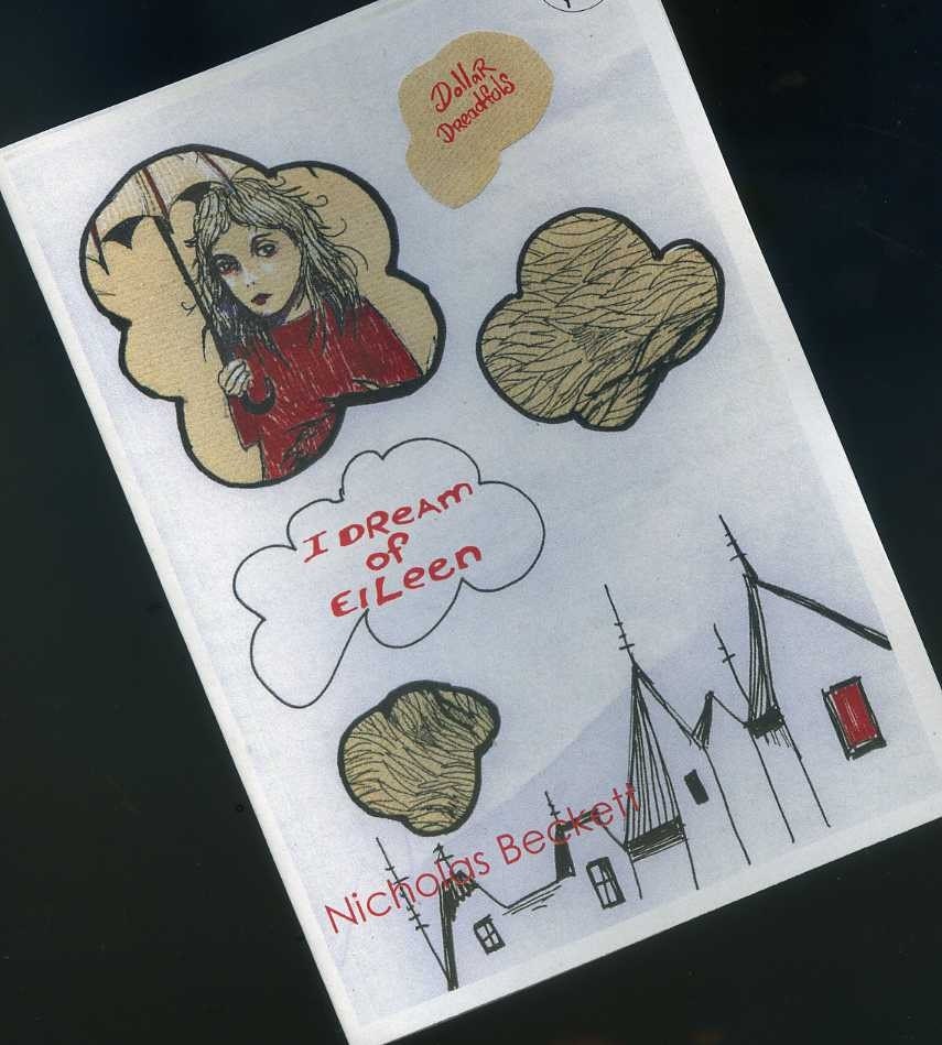
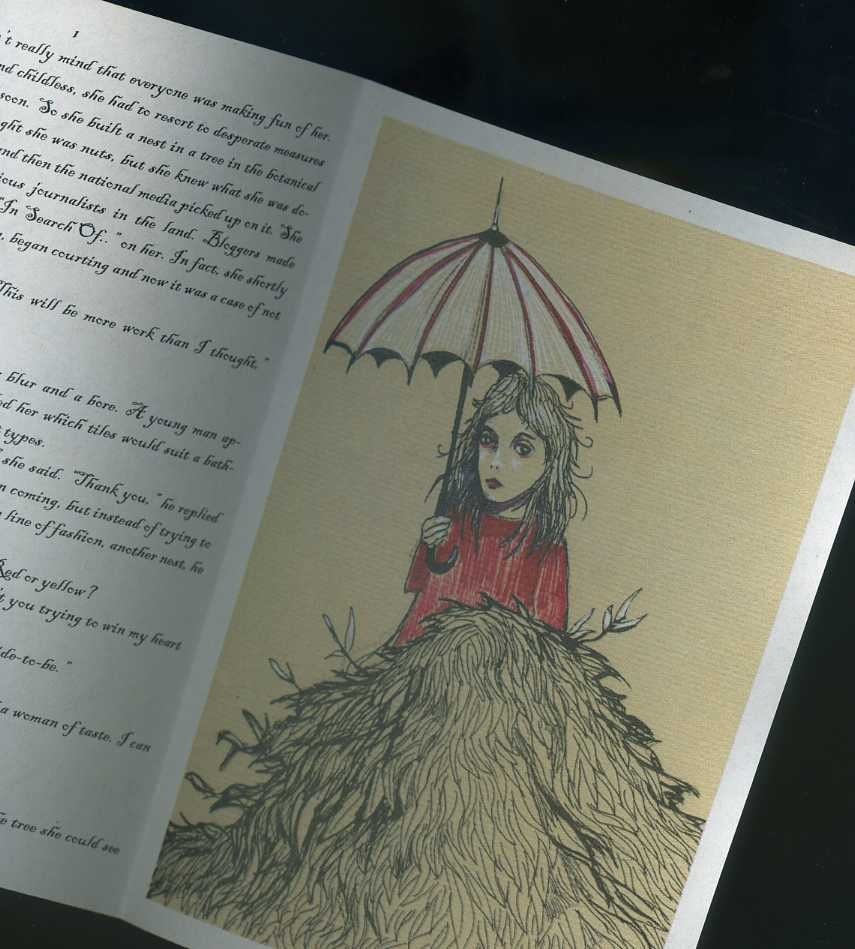
I Dream Of Eileen - Dollar Dreadfull - mini story
Another hand drawn zine . I could see myself creating zines like this, I would just need to get the type and layout right.
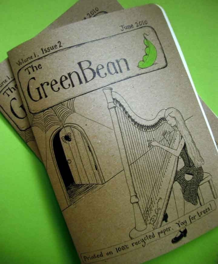
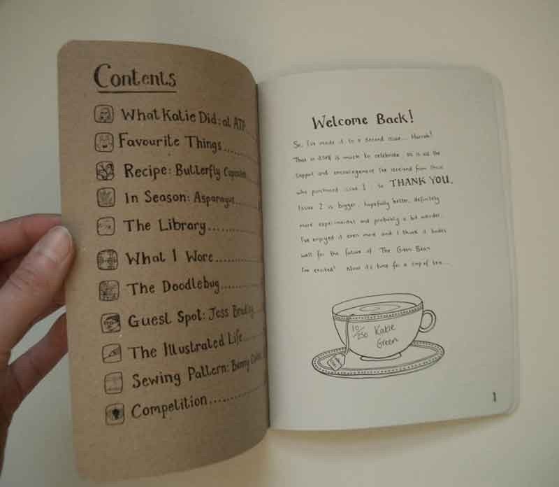
Green Bean
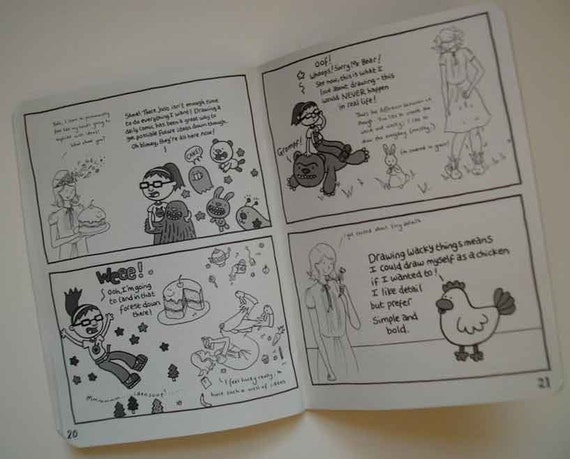
I hand made Zine I found on etsy.com where people can make thing and upload them to sell.
It is a hand drawn story all in black and white.
Subscribe to:
Posts (Atom)